01
Existing experience research
- Usability testing across digital touchpoints
- Experience audit of digital and service touchpoints
- Data analysis, triangulating quantitative metrics
- Vendor research findings
- Friction mapping of experience gaps


AARP's Scams & Fraud program offered consumers several ways to find information, identify scams and get support, but these experiences sat across six separate digital and service touchpoints. I co-led an experience strategy initiative to understand consumer needs across the ecosystem, identify opportunities for improvement and set a shared direction for all six.
Team structure · 20+ stakeholders
Chapter 01
AARP's Scams & Fraud program reached consumers through six touchpoints, each managed separately. Although each served a specific purpose, consumers encountered them as separate parts of one support ecosystem. The challenge was to understand how these experiences could work together to support consumers more effectively.
Challenge 01
Consumers could enter through six separate touchpoints, each built and managed on its own, with no shared path between them.
Challenge 02
Behind those doors sat many offerings, from the helpline and watchdog alerts to webinars and local events, each meeting a different need at a different stage of the journey.
AARP's fraud offerings mapped against the consumer journey, from awareness to action.
So we asked ourselves
How might we move beyond optimizing individual touchpoints to creating a connected experience organized around the needs of older adults?
About scams and fraud
The landscape we were designing for
These four realities, from our research and strategy primer, explain why the moment someone reaches AARP's fraud content matters so much, and why the experience had to change.
Based on research conducted by the AARP Research Center of Excellence.
Scammers deliberately target the 50+ audience due to their retirement savings.
Today's scams are harder to recognize than ever.
Shame and eroded trust follow a scam.
Some arrive in crisis; others just want to check.
Chapter 02
Consumer research, Jobs to Be Done research, vendor findings and analytics, synthesized into one view of consumer needs.
01
02
03
Journey maps based on existing research, validated by further research.
Early fraud journey sketch: before, during and after an incident.
Financial shocks journey map
Across user research conducted on Scams & Fraud assets, these are a few examples of the insights we gathered.
01
“Just knowing I have these two resources here as a backup or a Plan B… is comforting.”
Design implication: keep the helpline and Ask AARP support inline across the experience.
02
“…if you're not aware that there are charity scams out there, how can you know what to look for.”
Design implication: bring scam types forward as an active verification feature.
03
“I don't want to, at that point, read a lot of prose about it.”
Design implication: restructure scam articles as scannable fact sheets led by verification and action.
Strategic direction
Three priority Jobs to Be Done
With six experiences serving different functions, we needed a common framework. I led the Jobs to Be Done research and synthesis, and used opportunity scoring to prioritize three jobs.
When I'm going about my day
Secure and protect my personal information and devices
ODI score 13.1*
Outcome-Driven Innovation (ODI) scores each need by how important it is and how poorly it is satisfied today; scores above 10 signal an underserved opportunity.
When something feels off
Verify whether a communication attempt is a scam or fraud
ODI score 12.9*
Outcome-Driven Innovation (ODI) scores each need by how important it is and how poorly it is satisfied today; scores above 10 signal an underserved opportunity.
For me and the people I care about
Protect myself and my loved ones from scams and fraud
ODI score 13.2*
Outcome-Driven Innovation (ODI) scores each need by how important it is and how poorly it is satisfied today; scores above 10 signal an underserved opportunity.
*Research conducted across 551 participants
In an exhaustive Excel sheet that tired our eyes, we mapped out all resources across AARP, and which JTBD they serve primarily.
Outcome
These became the shared criteria for evaluating all six touchpoints, so each had a clear role in supporting consumer needs.
AARP fraud offerings mapped to consumer jobs before, during and after fraud.
Our guiding principle
Many people arrive under stress, when their ability to make decisions is reduced. We used journey mapping to locate these moments of anxiety, and centered the entire experience on meeting people there first.
The strategy was translated into five design principles to guide consistent decisions across teams and touchpoints.
Minimize clicks, scrolling and detours between a consumer and the help they came for.
Structure content around consumer intent, not internal business units.
Let people verify and act quickly, with deeper context available when needed.
Reinforce credibility through expert review, transparent sourcing and consistent patterns.
Reduce cognitive load and keep support one step away for people under stress.
These design principles also helped shape experiences such as Medicare, Social Security and Caregiving where relevant.
Experience orchestration
Where to redesign, improve or keep
I assessed each touchpoint against the three jobs, research insights, friction and potential impact, then used a priority matrix to decide the level of intervention.
Serves as the front door for all three priority jobs.
Moved from a blog post about the helpline to direct service delivery.
Softened with a human tone that recognizes the stress of the call.
Helps people verify whether something is a documented scam.
Supports protecting loved ones, e.g. alerts for a parent's neighborhood.
Its clear structure already helped participants orient themselves.
Every workstream that came out of this work was taken through the human-centered design process, from discovery to delivery, and continues through it today.
Org alignment and process
Aligning stakeholders around a shared vision
An integrated experience required alignment across the teams responsible for different platforms, products and services. I led executive stakeholders through discovery, ideation and alignment workshops, and translated the outcomes into actionable next steps.
From strategy to design
Applying the principles
Design implications for the overall experience, landing page, articles and visual guidelines.
Principles in practice
These are some examples of the many ways in which we applied the principles.
Scams & Fraud landing page
Principle · Shortest path to the answer
Report, verify and get help lead the page ahead of browseable content, with the helpline and Ask AARP support kept inline. Two concepts, Tango and Beacon, were tested with consumers.
Scam-type articles
Principle · Depth available, never required
Articles were restructured into scannable fact sheets led by verification and action: warning signs, how to stay protected and how to get help, with the full story below.
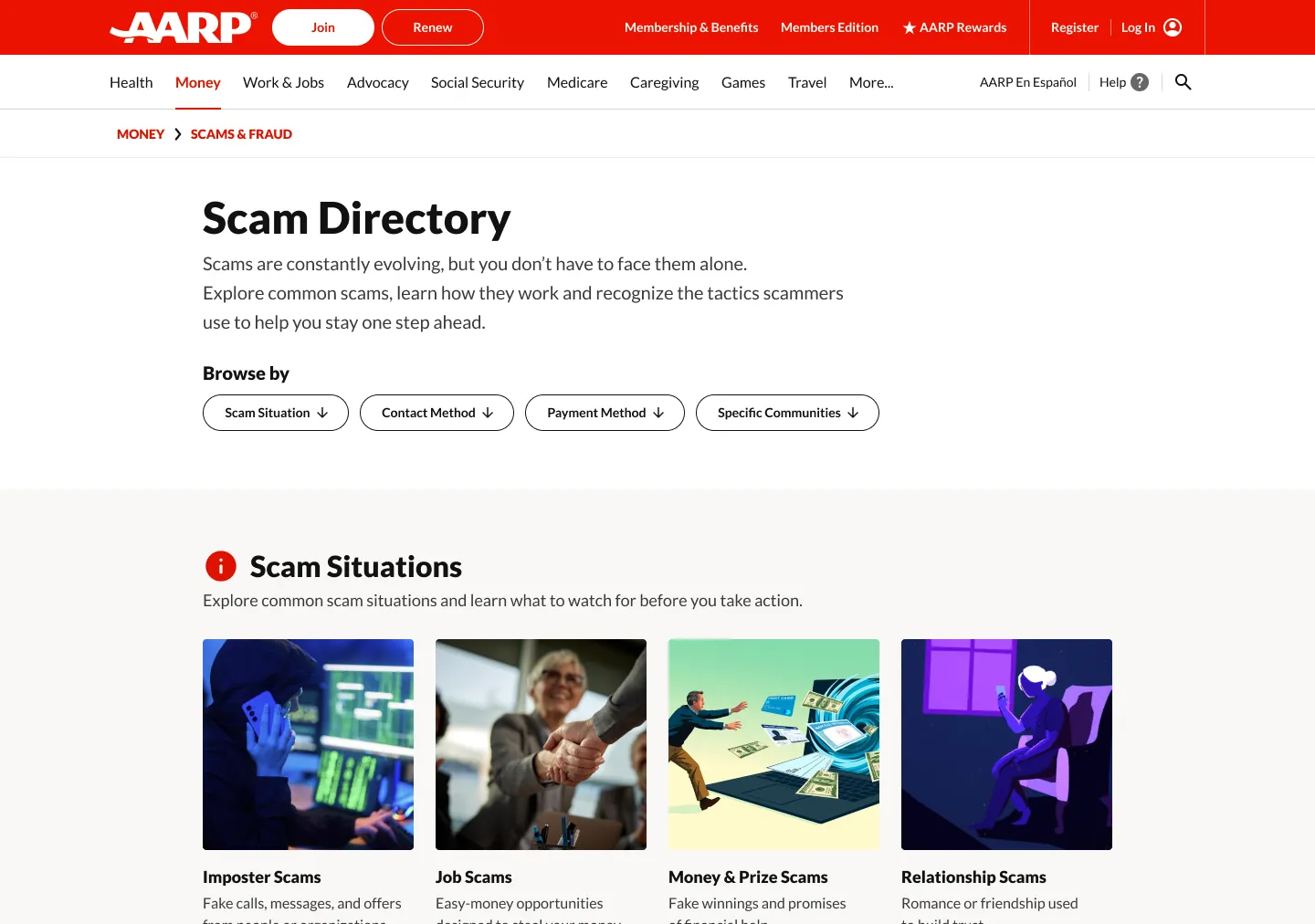
Scam directory
Principle · Organized around how consumers think
Card sorting with consumers shaped how the directory is organized, so people can browse by scam situation, contact method, payment method or community.
Scam-tracking map
Principle · Shortest path to the answer
Impact in one quarter
103%
increase in click-through rate
25%
increase in SEO and GEO performance
Reflection
Optimizing individual touchpoints is not enough when consumers move across a complex service ecosystem.
Jobs to Be Done can become a shared strategic language across teams.
Strategy needs organizational alignment, and a link to implementation and measurement.
There is so much more on this project that I would love to share and get into the weeds about. Please contact me and let's get talking!